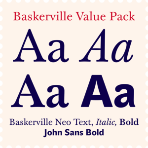
The standard of the classics, considered by many to be the most trusted typeface in the world.
This early baroque typographic gem is crafted with passion to variable font.
Industrial, calm and solid, ideal for branding design.
Reliable scientific text workhorse.
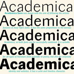
Czech Modernist Masterpiece.
The most trusted typeface in the world for best price.
Until recently the story of this type face ended with mediocre digital versions, which did not get at the root of its inspiration.
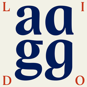
Lido was created before the year 2000, in the conditions of developing digital typography.
A universal typeface for books, magazines and newspapers is economizing, quiet, strong in drawing, but original and peaceful at the same time.
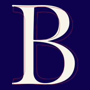
The iconic 19th century modern book superfonts.
Essential high-contrast headliner.
Cold, perfect and strict organizer.
Baskerville's perfect companion.
A sans-serif that is NOT neutral.
This Antikva and Italic are well-known perhaps to all Czech graphic artists and typographers ever since their release.
Our eye is able to join missing parts of worn letters back into undisturbed shapes.
There is a moment in everyone’s life when they start wearing glasses and I am no exception.
Metron is so far the most ambitious typeface made to order in the Czech Republic.
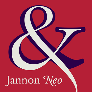
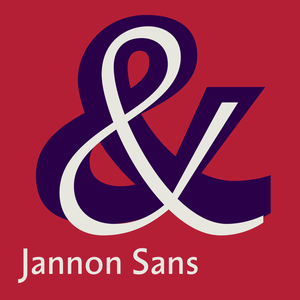
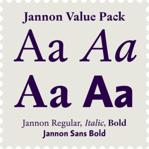
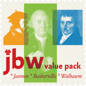
The engraver Jean Jannon ranks among the significant representatives of French typography of the first half of the 17th century.
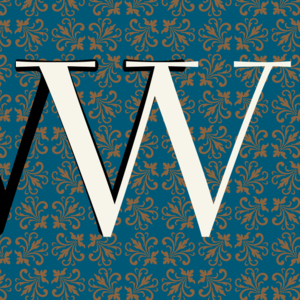
For romantic literature at dawn of the industrial revolution.
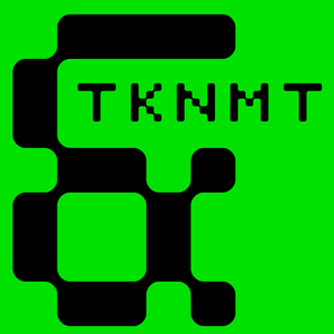
Matrix dot printer font with rounded edges, can be used in extremely small sizes as well as large on posters.
Dark, spicy & distinctive display typefaces from the nineteenth century I had in mind when creating this font family.
A friendly font for large scientific volumes, but also poetry and small periodicals.
Tombstone and identity cornerstone.
Contemporary legible font kit for easy reading.
Designing font family systems has become a fashion ever since the beginning of digital typography.
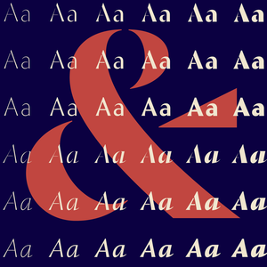
Baroque design, music and architecture, historical books, catalogues, posters and social media.
The concept of the Baroque Roman type face is something which is remote from us.
Tested by centuries of reading.
Reliable scientific sans-serif.
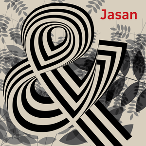
Jasan is the Czech expression for ash tree (Fraxinus Excelsior) which provides great wood for tools and furniture.
Designed in 1999 for an inscription on Santini's architecture.
Jannon, Baskerville, Walbaum and their sans-serif companions.
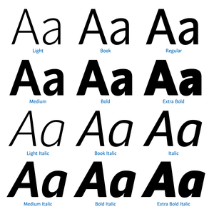
The traditional division of a type-face family into four designs pertains to every body type.
A confession of love for baroque typography.
For striking poster, identity, webdesign and book jackets.
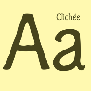
Clichee is a result of my juvenile experimentation with the first version of Fontographer back in 1993.
Andulka was drawn in 2004 for the purposes of publication and visual identity.
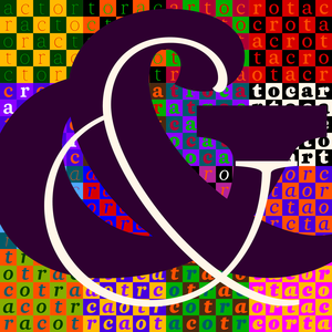
Another confession of love for baroque typography.
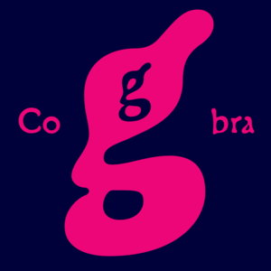
A cross between a Roman type face and a slug, a type face with blurred letters, inspired by a tropical snake remotely contained in the letter "g".
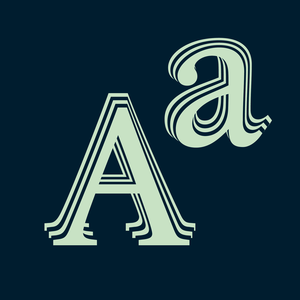
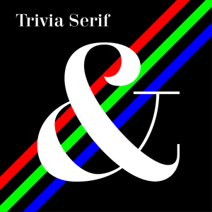
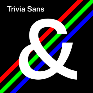
Trivia Serif 10 is an addition to the Trivia type system consisting of forty styles.
Inspired by a tombstone lettering dated from about 1900.