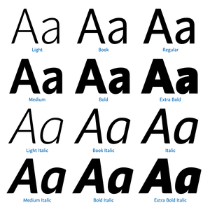
In the mid-1980s, a re-evaluation of fundamental typographic categories was taking place here, driven by the now-forgotten technology of phototypesetting. We were seeking a contemporary expression and wanted to distance ourselves as much as possible from the overused classic sans-serif typefaces. Rathouský’s Metron was the best option at the time, and we owe our initial inspiration to it. Inicia is an ideal typeface for information systems and visual identity; it is also well-suited for magazines, exhibition projects, and invitations.
Our range of variable font families is growing rapidly. Personally, I use only variable fonts for my projects.
Check out the latest additions here.