Storm Type News, June 1, 2025
Why Superfamilies?
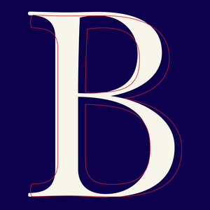
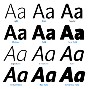
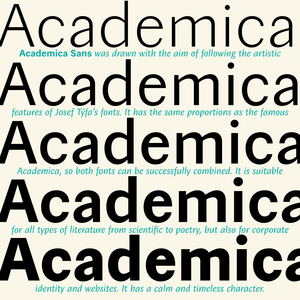
Giant superfamilies are fun to play with. But the idea isn’t new. Multiple Master did something similar back in the ’90s. Today we call it “Variable” fonts, it plays the same trick, and the ending feels familiar too: hardly anyone actually uses them. With one big exception: Type designers. Nowadays, every new typeface I make is variable by default. They save time at every stage—drawing, spacing, kerning, adding accents. Instead of tweaking every style manually, I make an adjustment once and it flows through the whole system.
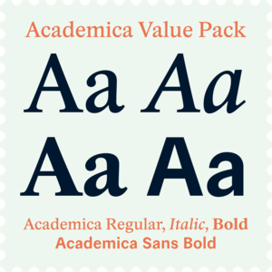
That’s why at Storm Type Foundry, we’re able to offer custom weights as standard font purchase. So, for example, if Medium is too light and Bold is too heavy, (and variable too difficult) we'd be happy to create a perfectly tuned interpolated style just for your project. Your brand, your weight, your creativity.
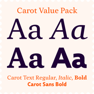
Featured fonts:
Melange,
Moyenage,
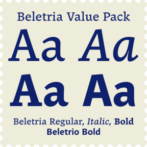
Beletria.